Wednesday, 30 September 2009
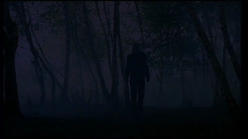
Anonymous image from mini greenshines
This summary is not available. Please
click here to view the post.
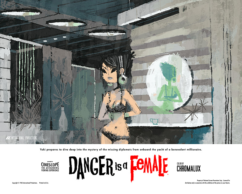
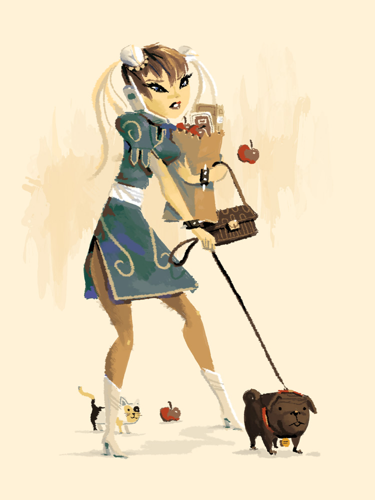
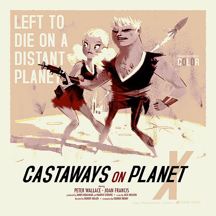
Kevin Dart
(click to expand and enlarge image)


I've got no good reason for posting this gentlemans work on an appropiation art blog, other than the fact I love it that is! His cutesy and shapely women look their best in his old school Bondesque posters for his fictional film series Yuki 7. I know the feminists and the body art fans out there won't like it but i'm afraid i'm going to have to put aside those critical protests and indulge myself. I did warn readers in my introduction post that I may contradict myself.
An Introduction to Fallen Over

I've got no good reason for posting this gentlemans work on an appropiation art blog, other than the fact I love it that is! His cutesy and shapely women look their best in his old school Bondesque posters for his fictional film series Yuki 7. I know the feminists and the body art fans out there won't like it but i'm afraid i'm going to have to put aside those critical protests and indulge myself. I did warn readers in my introduction post that I may contradict myself.
Sunday, 27 September 2009
Fred Muram
(click to expand and enlarge)


Every project photographer Fred Muram presents us with the startling results of his mechanically simple projects is singular and surprising. Although all of his work operates on the principle of abstracting ordinary locations, people and objects or by conjuring surrealist scenarios without bending the rules of physics and biology - Fred has yet to become predictable and his various strategies for finding the extroadinary in the ordinary. My favorite works are to be found in his Rug series which all feature the human form obscured by rolled up rugs. I like how its unclear wether or not one individual played the role in all photographs or if many contributed their bodies for the project. Regardless of that it results in images that cleverly and gently veer between cosy humour and unfamiliar anxiety. They are by no means fearful looking creatures but there is also something almost inhuman/extrahuman about them.
An Introduction to Fallen Over


Every project photographer Fred Muram presents us with the startling results of his mechanically simple projects is singular and surprising. Although all of his work operates on the principle of abstracting ordinary locations, people and objects or by conjuring surrealist scenarios without bending the rules of physics and biology - Fred has yet to become predictable and his various strategies for finding the extroadinary in the ordinary. My favorite works are to be found in his Rug series which all feature the human form obscured by rolled up rugs. I like how its unclear wether or not one individual played the role in all photographs or if many contributed their bodies for the project. Regardless of that it results in images that cleverly and gently veer between cosy humour and unfamiliar anxiety. They are by no means fearful looking creatures but there is also something almost inhuman/extrahuman about them.
Wolven Angel

Impossibly underrated. Its easy to skim over names when browsing through the annals of IDM/Electronica territory but with (to date) only 2 listeners on last.fm this surely rates as one of my most overlooked flavor of the month. I like the contrast of dusty arcana imagery when you put it in context with his down-tempo sci-fi stylings. Like a more atmospheric Chevron sans the comedy or a heavily distorted and pained version of Rival Consoles. Go on his last.fm profile and listen to Ballerina Mists.
http://www.last.fm/music/Wolven+Angel/
An Introduction to Fallen Over
Saturday, 26 September 2009
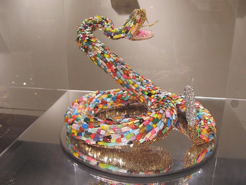
Alex da Corte
(click to expand and enlarge image)


 Isn't it nice how after so many decades Pop art and pop culture in general still holds true in the art world. Or to be more precise how tasteless materials and imagery are often considered at the same level as expensive or heirachially favored ones. Taste and refinement is boring. Alex da Corte seems to take particular pleasure in forming garish eye snogging miraculous hallucinations from multi-media works ranging from photography, sculpture, installation, text work and more besides. Its easy to see the initial glitzy splendour however there are less than subtle signs of discontent and angst once your sight has adjusted to the flood of celestial rainbowlight colored light. Dangerous serpentine animals (some realistically rendered, others scrappy like soft toys), young men trying to win back the hearts of their snubbed lady friends, good old fashioned trouble in paradise stuff. Rather than rampant nihilism da Corte seems to want to make us see the inherant beautyof our little fears and anxietes.
http://alexdacorte.com/

 Isn't it nice how after so many decades Pop art and pop culture in general still holds true in the art world. Or to be more precise how tasteless materials and imagery are often considered at the same level as expensive or heirachially favored ones. Taste and refinement is boring. Alex da Corte seems to take particular pleasure in forming garish eye snogging miraculous hallucinations from multi-media works ranging from photography, sculpture, installation, text work and more besides. Its easy to see the initial glitzy splendour however there are less than subtle signs of discontent and angst once your sight has adjusted to the flood of celestial rainbowlight colored light. Dangerous serpentine animals (some realistically rendered, others scrappy like soft toys), young men trying to win back the hearts of their snubbed lady friends, good old fashioned trouble in paradise stuff. Rather than rampant nihilism da Corte seems to want to make us see the inherant beautyof our little fears and anxietes.
 An Introduction to Fallen Over
Werewolf Jerusalem
I felt it was time to make a music related post as the visual/conceptual aren't my only interests. Whilst reading the Powerlines section of Zero Tolerance magazine I came across the work of a man eloquently named Richard Ramirez. His brand of noise is painfully minimal, dense, and always seemingly on the verge of falling apart. On his myspace he cites his influences include old exploitative horror films and the broken static between radio stations. If your a fan of Kylie Minoise at his most stark and unrelenting or would like to hear what a rawer and less melodius Nackt Insecten would sound like then I heartily recommend Werewolf Jerusalem. Go on his profile (link provided below) and listen to Knock On The Door.
http://www.ztmag.com/
An Introduction to Fallen Over
Friday, 25 September 2009
Unscheduled time off work
I've been suspended from work this week, surprisingly with full pay, which is nice of Asda to say the least. Considering the reason I was sacked was because I took offence at the new store manager labelling me an 'internal terrorist' for commiting the heinous crime of disagreeing with him. My afforementioned punishment means i've had plenty of spare time on my hands to go look at art, boredom being a major requisite in appreciating and writing about art. Rather than hide out at home in shame awaiting to be summoned so I can once again embrace the loving bosom of my employers I instead chose to visit both the Wolverhampton Art Gallery and the IKON Gallery in Birmingham.


I personally wouldn't recommend the Wolverhampton place to anyone. Eclectic multiple-show venues can be good if either given a clear distinction between exhibitions or tangiable and convincing links between them. The New Art Gallery in Walsall pleasantly hadoukens its way into my memory. However i've never been to a gallery more thrown together and half arsed than this. I had a bad feeling the very second I walked in and saw Steve McQueens new cabinet work featuring mock up postal stamp sheets printed with the faces of soldiers whom have died during service in Iraq. I was invited to sign a petition to have these things circulated into actual use. I politely declined. Lets just say i'm not on board when it comes to this idea that men and women are fighting in the middle east to ensure the freedom of gods own country. Besides, being an internal terrorist it wouldn't be the right thing to do.
To be fair to Wolverhampton things started to look up when I nervously backed away from McQueens piece (whilst dodging all the imaginary rolled up Sun newspapers eager to smack me over the head in heroic righteousness) when I entered into the somewhat more reasonable and open ended exhibition about conflict. The Northern Ireland Collection: Fresh Perspectives had some exceedingly good work on show. Much touted (and rightly so) were Paul Grahams large photographs of Irish locales bearing traces of the animosity between protestants and catholics such as graffiti, paint marks 'tagging' territory and military personal conducting a stop and search on a quiet country road. Rita Duffy's altered object sculpture Veil takes a cruelly small and cramped cell from a disused womens prison and through the spy holes you'll a vibrantly/violently red interior with glass tear drops hanging from its ceiling. A very potent message for how easily basic human rights can be suspended in face of political and social strife.
Sadly there wasn't much that inspired me after that. There was some cutting edge ceramics by someone called XUE Lu in a main exhibition space foyer, seemingly just there because they could be. They were rather good to be fair. If only the gallery could of been bothered to organize an ACTUAL collection as opposed to about 5 plates on a pedestal. There was a strangely funny animation hidden under some stairs by a man called Andrew McDonald which featuring a headless man pottering around on a rocky landscape shaking his fists and hiding just below the outcrops edge. It was much better that all the lovely chummy paintings of cats and soft porn nudes in the next room.
Needless to say at this point I gave up on the place. There was some victorian art upstairs and another exhibition about works on paper. Apart from fairly interesting additions by Toby Ziegler and Ruth Claxton it was equally dull. I won't mention the sense room, at least not without shuddering with cliched fear. Wolverhampton Art Gallery isn't doing itself any favors by trying to be every kind of art gallery and museum imaginable. The space could be used better in an IKON gallery esque manner. Hosting 2 or at most 3 solo exhibitions. Its a varied venue but its so badly curated that its events totally lack any sort of context and ultimately any point.


However - today I went to the IKON in Brum, and once again that wascally' gallery has given me nothing to complain about. The 1st floor exhibition of Victor Alimpiev's video art (including the very surreal To Trample An Arable Land, the name co-opted as the exhibitions title) was definately my highlight of the month. The first video you are confronted with shows the back of two girls heads. The one furthest from the viewer stands next to a long pinkish curtain or flag, the closest to us stands behind the other performing odd and seemingly senseless actions with her hand against the nape of more distant girls neck and back.
Though gentle and achingly uneventful her actions feel threatening and suggest infliction, but its that subtely I mentioned that undermines that fearful aspect with something more intimate and consensual. There could be elements of both in their relationship, or none at all. The facelessness and muteness of the actors makes this video his most abstract and thus could be read in very non figurative non emotive ways. Whilst chatting about it to one of the guides a mother and her young children sat down to watch the piece. One of her sons whispered "is this going scary mum?" with a noticeable tremble in his voice. He's got a point.
The exhibitions self-titled piece was esoteric... Oh all right it was difficult and bloody odd! But i'd say thats its strength and ultimately why I liked it so much. Unlike the afforementioned video we actually saw our protaganists faces. There was four girls stood on the lowest point of a ramp and behind them were an indeterminate amount of other people carrying flagpoles. My current estimate after watching the credits at the end and being surprised by how many people actually performed / how many I actually saw is about 500 billion individuals. Over the course of 15 minutes they inched up the ramp, stopping often to crouch or sit down, in one of the most brutally minimal and slow performances i've ever seen commited to film. Another piece that held my attention was Wie heisst dieser platz? which involved a young lady speaking to (eventually almost screaming) at a group of uncomfortably huddled in German. They slowly but surely turn their heads away from her, exiling her from the group. She stands right up to their faces but even this is enough in Alimpiev's closely shot world to suggest ostracization.
You really should go see this if you live in Birmingham and are even vaguely interested in video and/or performance art. Two other pieces called My Breath and Whose is this exhalation? are featured are they throw in some theatre/opera elements for good measure. Apparently theres another video showing in the tower room but being the huge prat I am forgot to go see it for myself.
On the 2nd floor are some very good paintings by someone called Semyon Faibisovich. He takes pictures on his mobile phone of unpretentious and slightly eccentric individuals he comes across in his native Razgulyai district in Moscow. He then expands and enlarges this pixellated photorealist paintings. One piece entitled Builder is massive. It consists of gargantuan close up of a vaguely bemused builders face spread out over two canvasses. I could of swore it was bigger than my house. Whilst it didn't captivate me in the same way Alimpiev's complex non-narratives did it nethertheless fills me with joy when an artist paints the ordinary to reveal the extraordinary. Not a bad day by any means when you consider that I was supposed to be stacking shelves.
http://www.wolverhamptonart.org.uk/
http://www.ikon-gallery.co.uk/
An Introduction to Fallen Over
Wednesday, 23 September 2009
Armen Eloyan
(click to expand and enlarge image)


I discovered this fellow in the newest issue of Art Review in the exhibition review pages. I immediately liked his demented and hellish take on 'bad painting'. Like George Condo, Armen fills a void in my heart that spastically and unconsequently violent cartoons used to fulfil before they became undesirable. What makes paintings like this so vital however is that the zany characters and wacky scenarios take on an air of menance and horror when frozen into these cramped and lavish paintings. The safety of the cartoon worlds "bounce-back" physics has collapsed and now your forced to see how these individuals have mutilated themselves.


I discovered this fellow in the newest issue of Art Review in the exhibition review pages. I immediately liked his demented and hellish take on 'bad painting'. Like George Condo, Armen fills a void in my heart that spastically and unconsequently violent cartoons used to fulfil before they became undesirable. What makes paintings like this so vital however is that the zany characters and wacky scenarios take on an air of menance and horror when frozen into these cramped and lavish paintings. The safety of the cartoon worlds "bounce-back" physics has collapsed and now your forced to see how these individuals have mutilated themselves.
An Introduction to Fallen Over
Hannah Greely


Hannah's works aren't easy to find on the internet, I had to resort to image searching on Google and even then only finding pieces i'm already familiar with. Still though the above sculptures are the very reason I found Greely's work so appealing. I haven't seen another artist who can best her at imbuing anthropomorphic qaulities to ordinary objects and seemingly uninspiring materials. The topmost image entitled Joe is one of a series of Budweiser bottle pieces each with similarily common first name titles. More so than any of the artists other work invoke sympathy for their apparently self destructive and disassociative 'behaviour' - however they are merely inanimate objects. One could argue that the sympathy we feel for these post-modern homonculi
is actually a reflection of our own fears and anxieties.
An Introduction to Fallen Over
Tuesday, 22 September 2009
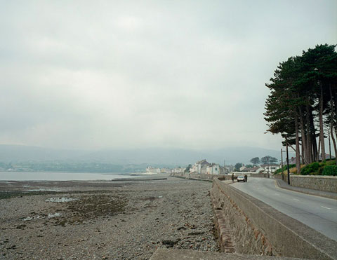
Damon Zucconi


 Olympic (Snow)
 Today I flicked to the very last entry in Phaidon's Younger Than Jesus book and found this nice young mans work. Straddling cautiously somewhere between appropiation and new media Damon has produced some neat trickery on his website - including found animated GIFs 'asserting' themselves as art objects, heavily manipulated and/or reactive videos of people dancing or soundtracked by trance, rave and techno music, as well as the more standard browser visual experimentation one would expect from a new media artist. His work gently and undogmatically hints at a believable future for art where physical objects and even places/installations are considered old hat. I've provided a few links in addition to the normal 4 images of my favorite Zucconi browser works.
Don't go to the Natural History Museum
In Disneyland there is little that is more subversive than a service closet left open exposing a mop and bucket. ~ Mark Dion
As long as I can remember, long before I was interested in art, i've wanted to visit the Natural History Museum. In my mind (influenced by the countless documentaries and films i've seen set in the place) I had imagined an intimidatingly large and academic layout similiar to the V&A or the British Museum. 4 months ago I went with my family as it seemed like a place we could all enjoy, I certainly (desperately) wanted to see it for myself. The main entrance with Darwin's statue atop the stairs was everything I dreamt it to be (i'm an admirer of the Ankylosaurus skeleton in the foyer) and for a fleeting dewy-eyed moment I felt as if I was one the greener side of the fence. It has always sold itself as a place supposedly dedicated to learning and a store house for all relevatory obscura relating to nature and terran life. Once I skipped merrily through the foyer however i'm afraid my overenthusiastic and scarily child like joy was given a surprising kick to the balls.
Basically if you've never been to the NHM i'll expain the buildings layout. A gargatuan entrance (as described above) with about 5 corridors open to the public. All the really interesting stuff apparently isn't on show. It was all interactive dioramas, colourful fact boards aimed at the propeller-beanie wearing demographic, items you could touch - *shudder* - maybe i'm old fashioned. I'll fully admit i'm a pretentious cunt but I hate those sort of museums. I feel like my intelligence is being insulted and that i'm being spoken down to. I saw one display descriptor that read something along the lines of "Ichthyosaur: These are the remains of an Ichthyosaur" - duuuuuuuuh gee thanks! ... It was all a bit to ThinkTank for my liking.
They ought to get Mark Dion to go in and rearrange everything as he sees fit. Let him challenge the audience and open the rest of the bastard museum up! Wunderkammer it up a treat.
An Introduction to Fallen Over
Friday, 18 September 2009
Karen Tam's 'Miss Chinatown' (2009)

Let me share a moment of bite-the-back-of-hand wonderment I experienced several months ago at The New Art Gallery in Walsall, during their food themed exhibition Pot Luck. Karen Tam installed a life sized hyperrealistic canadian/chinese restruant right the middle of the exhibition space. The details were staggering. Right from the kitschy decor, a toy panda bluetacked to the till, cute Zodiac mascots of the menus, stereotypical laughing Buddhas sat beside Pikachu and Hello Kitty figurines on a shelf, ceramic soup ladels carelessly mixed with plastic forks in utensil service trays, the strangely misplaced and very western bag of Walkers crisps in the kitchen, etc.
Minus the action and inhabitants it became a palpably spectral sensation. As if i'd stumbled into a place I ought not to have been, like i'd made a wrong turn in the gallery and ended up in the staff room. Despite its purposeful banality Karen has taken a ordinary event (going to a restruant that is) and transferred its geo-psychological context in an alien place - thus jumbling the viewers ability to appropiately select a mode of public behaviour. I'm conciously in a muesuem and thus in full on 'art mode' but my eyes insist i'm not. Rothko might make people cry but his art never made people feel hungry.
Tim Berresheim
(click to expand and enlarge image)


 I came across Tim Berresheim and two years ago and I admit upon first seeing his work I felt as if my eyes were going to projectile vomit. But then I realized that such a reaction is a good thing! You don't always get your moneys worth out of modern art. The artist uses computer graphics in order to "surprise himself" as he puts it. This results in the kind of mind numbing surrealism the world hasn't really replicated since the 50's. I've grown to love his art because of its decidely user-unfriendly appearance. Its tempting to say that such ambiguity leaves the images open to interpretation but I think their strength lies in how illegible they are. What can one say when faced which such visually confounding art?

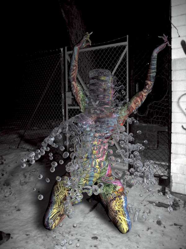
 I came across Tim Berresheim and two years ago and I admit upon first seeing his work I felt as if my eyes were going to projectile vomit. But then I realized that such a reaction is a good thing! You don't always get your moneys worth out of modern art. The artist uses computer graphics in order to "surprise himself" as he puts it. This results in the kind of mind numbing surrealism the world hasn't really replicated since the 50's. I've grown to love his art because of its decidely user-unfriendly appearance. Its tempting to say that such ambiguity leaves the images open to interpretation but I think their strength lies in how illegible they are. What can one say when faced which such visually confounding art?
Wednesday, 16 September 2009
Anonymous image from VVork.com
 I've been at it again. Sifting through all the eco bandwagon warrior shopping bag for life illustrations on ffffound!.com in search of suitable artwork to blog about. I came across this. I absolutely love how the artist has abstracted the figurative by such an elegantly simple means. A moment of faulty beauty captured in the hiss and crackle of the worlds inescabable visual artifice.
I'd love to tell you who made it. However after a bit of incredibly rubbish detective work on my part i've only gathered that its origins was the website VVork. I assumed by reading the images URL address that I would find the picture and its respective information in the june 2008 archives. Alas I found many other lovely things sans this Rewind image. After an unusuccesful though far from fruitless search through the rest of 2008's archives I got bored and gave up.
If you have any information regarding who made this piece please let me know via a comment or via email at abzhog@hotmail.co.uk - so I can give the artist/s due credit.
An Introduction to Fallen Over
Henrik Menné
(click to expand and enlarge image)
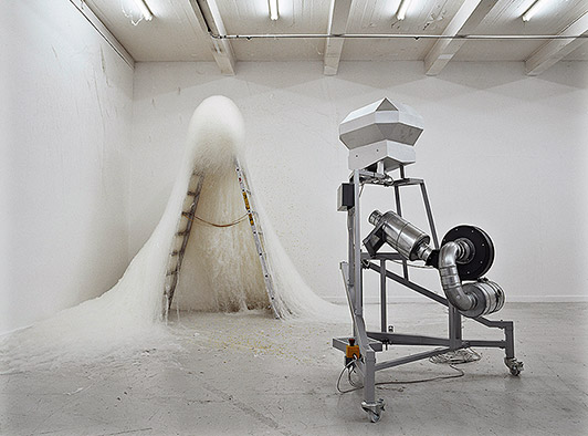


 I discovered this Henrik fellow accidently on ffffound!.com whilst trawling through the archives. Its looks to me as if these strange and enigmatic apparatus he creates are in themselves in the process of making sculpture. By working, balancing, heating and otherwise manipulating whatever materials are put into them Henrik has put a very industrious and modern take on process art - a genre gently on the rise among promising young artists hoping to throw more fuel on the fires of concept art.
Tuesday, 15 September 2009
Alejandro Almanza Pereda
(click to expand and enlarge image)


I've been rather obsessed with this mans health & safety worrying sculptures since coming across his work in Phaidons Younger Than Jesus* book. I particularly like his untitled pieces as shown above, unfathomable domestic constructions that threaten to collapse. I'm not sure wether these sculptures are genuinely the product of a nervous and precarious balancing act or if Alejandro employs some sort of cunningly hidden support structure, but despite having never actually seen said pieces I get a real feeling of disbelief and danger just looking at these photographs.
* This book is an appropiation junkies wet dream. I'll certainly be featuring some of the artists on this blog in the near future.
An Introduction to Fallen Over
Thank you very much for taking the time to read my humble blog. Here you find nothing more than the ramblings and findings of a working class kid inappropiately obsessed with modern art. I decided to start a blog for 2 reasons. 1) I felt like jumping on the independant art fans blogging bandwagon - and 2) Because I have (rather shockingly) a point to make about my favorite branch of post-modern art practice. That of appropiation and found art.
Have you noticed how we still try and give reasons for displaying otherwise ordinary objects in galleries and art establishments? Artists, curators and writers still seem to be quick to defend the genre/practice/whatchamicallit' etc via complex and academic philosophical contexts that (if we're honest) only a limited group will genuinely understand. However i've found the very reason I love this sort of art so much is purely because of how 'ordinary' it is. The artists ideas and the arrangement has made it extraordinary, not forgetting the beholders interpretation of course. This makes the objects +ordinary.
Surely we are at the point (or near enough) to accept that objects can trascend that mysterious 'art' barrier without icing them up with lengthy and dry systems of critical pardoning. Appropiation art doesn't need an excuse anymore. As much as I can appreciate and enjoy a beautiful, crafted, hierarchically tasteful art work as much as the average Daily Mail* reader I personally my preferences lie towards the broken winged. I like it when things look as though they've gone wrong - as if someone visiting the Garman Ryan collection had backed up to admire a Jacob Epstein sketch only to bump into and trip over one of his busts. The resulting mess of which would be my sort of art.
This won't be updated to strict timetable. But I aim to update at least once or twice a week. Thanks again for bothering to read this at all. Stick around and be amazed as I go ahead and contradict this first post many times over. I'll try to stick to art and news in a suitably Fallen Over canon. If you are an artist or know of a good artist please post any and all suggestions to my email at abzhog@hotmail.co.uk and i'll take a look-see. I'll at the very least consider your input.
Ben Harris
* Thats not very nice I know. I'll be good, honest...
~
[DISCLAIMER : I haven't asked for permission to use any of the images on show. I hope you'll understand that if i've appropiated any images from your site that my aim was to praise and promote your work for the sheer love of it. However if you would like me to remove any of your imagery please don't hesitate to email me at abzhog@hotmail.co.uk and i'll edit all offending entries]
Subscribe to:
Comments (Atom)