Showing posts with label appropiation. Show all posts

Tuesday, 27 October 2009

Michael Leon

(click to expand and enlarge image)


There isn't much I can say about this gentleman because I only just discovered him accident on ffffound.com. Michael has managed to fully pique my interest with his extremely varied multi-media works. He seems to traverse a carefully planned path between conceptual art and commercial graphic illustration and photography without resorting to hoary positive/negative pop cliches. He can make a chin stroking sculpture for gallery clients and then with absolute ease design shirts for Nike. Be a dear and check out his website. If you don't find at least one thing to like on it then i'll make my next article about Edwin Landseer.

http://michaelleonstudio.com/web/

An Introduction to Fallen Over

Monday, 26 October 2009

Darren Bader

(click to expand and enlarge image)


Not to be confused with Daren Bader, Darren Bader is a criminally overlooked artist on my part who just so happens to be in Phaidon's Younger Than Jesus publication. Seeing as i've browsed that book obsessively i'm not sure how I missed him, but miss him I did. In this article I hope to rectify that. The images above are taken from two of his exhibitions, the first pair of his installation Cat (2004) and the second pair from as = poaching the poachers (2007) shown at the Rivington Arms.
Its hard to quantify what it is I like about these accumulations of objects. Perhaps its because he uses some surprisingly under-used materials such as DVD packaging (see third image) or kitchen utensils unimbued with iconographic art history or context. Perhaps its his seeminglu totally unrestrained love of appropiation and his method of arranging it to suggest a totally open narrative. Theres no way you can look at his installations in full. To do so only gives a vague sensation of conmnectivity, or perhaps a place, outside the conventions of public or private use. Speaking of the private/public these arrangements don't seem to be aiming to provoke or push their viewers. It melds familiarity with the illogical and gently invites dialogue. The rooms exhibiting his work seem to have potential beyond their function of storing art. They look as though they could of been decorated and adapted by an individual half conciously without needing to consider the aesthetic qualities. This unknown inhabitant might lack furniture or refinement but he or she puts it to good use. Surrealist interior design perhaps? :p


Friday, 23 October 2009

Gabriel Hartley

(click to expand and enlarge image)


Continuing in the Bloomberg New Contempories vein that I initiated with my last blog about Daniel Pasteiner, this artist became one of my other favorites from 2008. Some of his most interesting and numerous works are his altered postcards. Theres something terrifically nightmarish about the pulpy abstract painted structures superimposed over otherwise lovely images of natural landscapes and picturesque buildings. They could be biological or architectural, or scarier still both - invasive places of habitation that grow over and around whatever surface or being they happen to land on like some macroviral eruption. They remind me of Aaron Curry's From Dwellers (In Vulgar Space) series.
Whilst his postcards suit the Fallen Over cannon and thus my love of readymade/appropiation best, some of his most eye popping works are his sculptures. Like the postcards they remind me of the huge oozing nameless things that Lovecraft fans daydream about. However the inherantly 3dimensional nature of sculpture makes them look like extraplanar animals frozen in our corporeal material universe. They don't look so much made as they do preserved.

http://www.gabrielhartley.co.uk/cv.html

Thursday, 22 October 2009

Daniel Pasteiner

(click to expand and enlarge image)


An old favorite of mine from Bloomberg New Contempories 2007* This first piece I ever came across can be seen in the topmost image and its entitled Noland. Lots of sculpters like to suggest movement or growth in their works, the impressive thing about this materially unheirachial is that during its creation it did just that. Its a frozen explosion of a 'done-in-one-go' creativity. Other noteworthy pieces are his architectural combines made of LED lamps, aberrant shelves and various fancy detritus. And his shrink-wrapped oil paintings of simplistic shapely patterns that hover gently between child-like COBRA style impulsiveness and minimalist tidiness.
Daniel seems to be interested in how paintings, readymades and mega modernist sculpture (you know the kind) have almost analgamated together in the 00's, how the borders between them have gone a bit soft. He seems less concerned with making dogmatic artistic statements and as he put it ~ "Visual pleasure is the key to my process." For an appropiation junkie like me his artwork is akin to ingesting Tibetan morning grass. Take time to check out his incredibly enigmatic single page website at http://www.danielpasteiner.com/public.html.

[*If you've read the New Contempories 2007 publication you might have noticed how much i'm essentially ripping their judges writing style off. I like to think of myself as a bargain basement critic.]

Wednesday, 30 September 2009

Sunday, 27 September 2009

Fred Muram

(click to expand and enlarge)


Every project photographer Fred Muram presents us with the startling results of his mechanically simple projects is singular and surprising. Although all of his work operates on the principle of abstracting ordinary locations, people and objects or by conjuring surrealist scenarios without bending the rules of physics and biology - Fred has yet to become predictable and his various strategies for finding the extroadinary in the ordinary. My favorite works are to be found in his Rug series which all feature the human form obscured by rolled up rugs. I like how its unclear wether or not one individual played the role in all photographs or if many contributed their bodies for the project. Regardless of that it results in images that cleverly and gently veer between cosy humour and unfamiliar anxiety. They are by no means fearful looking creatures but there is also something almost inhuman/extrahuman about them.

An Introduction to Fallen Over

Tuesday, 22 September 2009

Damon Zucconi


Today I flicked to the very last entry in Phaidon's Younger Than Jesus book and found this nice young mans work. Straddling cautiously somewhere between appropiation and new media Damon has produced some neat trickery on his website - including found animated GIFs 'asserting' themselves as art objects, heavily manipulated and/or reactive videos of people dancing or soundtracked by trance, rave and techno music, as well as the more standard browser visual experimentation one would expect from a new media artist. His work gently and undogmatically hints at a believable future for art where physical objects and even places/installations are considered old hat. I've provided a few links in addition to the normal 4 images of my favorite Zucconi browser works.


An Introduction to Fallen Over

Friday, 18 September 2009

Karen Tam's 'Miss Chinatown' (2009)


Let me share a moment of bite-the-back-of-hand wonderment I experienced several months ago at The New Art Gallery in Walsall, during their food themed exhibition Pot Luck. Karen Tam installed a life sized hyperrealistic canadian/chinese restruant right the middle of the exhibition space. The details were staggering. Right from the kitschy decor, a toy panda bluetacked to the till, cute Zodiac mascots of the menus, stereotypical laughing Buddhas sat beside Pikachu and Hello Kitty figurines on a shelf, ceramic soup ladels carelessly mixed with plastic forks in utensil service trays, the strangely misplaced and very western bag of Walkers crisps in the kitchen, etc.


Minus the action and inhabitants it became a palpably spectral sensation. As if i'd stumbled into a place I ought not to have been, like i'd made a wrong turn in the gallery and ended up in the staff room. Despite its purposeful banality Karen has taken a ordinary event (going to a restruant that is) and transferred its geo-psychological context in an alien place - thus jumbling the viewers ability to appropiately select a mode of public behaviour. I'm conciously in a muesuem and thus in full on 'art mode' but my eyes insist i'm not. Rothko might make people cry but his art never made people feel hungry.


Wednesday, 16 September 2009

Anonymous image from VVork.com

I've been at it again. Sifting through all the eco bandwagon warrior shopping bag for life illustrations on ffffound!.com in search of suitable artwork to blog about. I came across this. I absolutely love how the artist has abstracted the figurative by such an elegantly simple means. A moment of faulty beauty captured in the hiss and crackle of the worlds inescabable visual artifice.

I'd love to tell you who made it. However after a bit of incredibly rubbish detective work on my part i've only gathered that its origins was the website VVork. I assumed by reading the images URL address that I would find the picture and its respective information in the june 2008 archives. Alas I found many other lovely things sans this Rewind image. After an unusuccesful though far from fruitless search through the rest of 2008's archives I got bored and gave up.

If you have any information regarding who made this piece please let me know via a comment or via email at abzhog@hotmail.co.uk - so I can give the artist/s due credit.

An Introduction to Fallen Over

Henrik Menné

(click to expand and enlarge image)


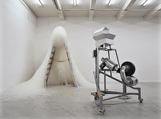
I discovered this Henrik fellow accidently on ffffound!.com whilst trawling through the archives. Its looks to me as if these strange and enigmatic apparatus he creates are in themselves in the process of making sculpture. By working, balancing, heating and otherwise manipulating whatever materials are put into them Henrik has put a very industrious and modern take on process art - a genre gently on the rise among promising young artists hoping to throw more fuel on the fires of concept art.

Tuesday, 15 September 2009

Alejandro Almanza Pereda

(click to expand and enlarge image)


I've been rather obsessed with this mans health & safety worrying sculptures since coming across his work in Phaidons Younger Than Jesus* book. I particularly like his untitled pieces as shown above, unfathomable domestic constructions that threaten to collapse. I'm not sure wether these sculptures are genuinely the product of a nervous and precarious balancing act or if Alejandro employs some sort of cunningly hidden support structure, but despite having never actually seen said pieces I get a real feeling of disbelief and danger just looking at these photographs.

* This book is an appropiation junkies wet dream. I'll certainly be featuring some of the artists on this blog in the near future.

An Introduction to Fallen Over

Thank you very much for taking the time to read my humble blog. Here you find nothing more than the ramblings and findings of a working class kid inappropiately obsessed with modern art. I decided to start a blog for 2 reasons. 1) I felt like jumping on the independant art fans blogging bandwagon - and 2) Because I have (rather shockingly) a point to make about my favorite branch of post-modern art practice. That of appropiation and found art.

Have you noticed how we still try and give reasons for displaying otherwise ordinary objects in galleries and art establishments? Artists, curators and writers still seem to be quick to defend the genre/practice/whatchamicallit' etc via complex and academic philosophical contexts that (if we're honest) only a limited group will genuinely understand. However i've found the very reason I love this sort of art so much is purely because of how 'ordinary' it is. The artists ideas and the arrangement has made it extraordinary, not forgetting the beholders interpretation of course. This makes the objects +ordinary.

Surely we are at the point (or near enough) to accept that objects can trascend that mysterious 'art' barrier without icing them up with lengthy and dry systems of critical pardoning. Appropiation art doesn't need an excuse anymore. As much as I can appreciate and enjoy a beautiful, crafted, hierarchically tasteful art work as much as the average Daily Mail* reader I personally my preferences lie towards the broken winged. I like it when things look as though they've gone wrong - as if someone visiting the Garman Ryan collection had backed up to admire a Jacob Epstein sketch only to bump into and trip over one of his busts. The resulting mess of which would be my sort of art.

This won't be updated to strict timetable. But I aim to update at least once or twice a week. Thanks again for bothering to read this at all. Stick around and be amazed as I go ahead and contradict this first post many times over. I'll try to stick to art and news in a suitably Fallen Over canon. If you are an artist or know of a good artist please post any and all suggestions to my email at abzhog@hotmail.co.uk and i'll take a look-see. I'll at the very least consider your input.

Ben Harris


* Thats not very nice I know. I'll be good, honest...

~

[DISCLAIMER : I haven't asked for permission to use any of the images on show. I hope you'll understand that if i've appropiated any images from your site that my aim was to praise and promote your work for the sheer love of it. However if you would like me to remove any of your imagery please don't hesitate to email me at abzhog@hotmail.co.uk and i'll edit all offending entries]