Tuesday, 27 October 2009

Michael Leon

(click to expand and enlarge image)


There isn't much I can say about this gentleman because I only just discovered him accident on ffffound.com. Michael has managed to fully pique my interest with his extremely varied multi-media works. He seems to traverse a carefully planned path between conceptual art and commercial graphic illustration and photography without resorting to hoary positive/negative pop cliches. He can make a chin stroking sculpture for gallery clients and then with absolute ease design shirts for Nike. Be a dear and check out his website. If you don't find at least one thing to like on it then i'll make my next article about Edwin Landseer.

http://michaelleonstudio.com/web/

An Introduction to Fallen Over

Mia Makila

(click to expand and enlarge image)


I first came across Mia's work via that contemporary art book I reviewed called The Upset. It seems after some cursory research that she is often labelled as a horror or gothic/lowbrow artist, however the first thing I immediately thought of when staring at the painterly abomination called Grimreaper (last image) was 'bad' painting. Mia definately deserves to have the humorous and perversely child-like aspect of her work analysed, its not all about angst and madness you know.
Like Armen Eloyan or George Condo, Mia gives a strangely nostalgic reminder of a time when cartoons could get away with being violent, its an alien sensation to most people of the 00's to have something other than media equivelant of baby food visually and audibly spoon fed to them. Theres also a hard sexual element to her work (particularly her paintings) thats about as subtle as that Funnelgirl meme. The ejaculatory splatters of white and pink paint are a harsh jibe at the myth of the heroic masculine painter, but they also give the works an unpretentious appearance as they ruin their own status as fine art objects. They invite abandonment and waste.
Some of her most unpleasant works are her altered antique photos. Presumably brought from flea markets and such, Mia violates the tenderness of these anonymous people by scrawling fanged visages over the individuals faces and surrounding them with phallic and blasphemous symbols. They remind me somewhat of Anna Barriball's ink and graphite altered photographs, only instead of cool and calm appropiation we have instead demented vandalism. We know Mia is an lovely, decent and law abiding person but theres very little in these alteration works to seperate them from the genuinely defiled artefacts of some lost vagrant soul. I admire an artist that can transcend taboos and ingrained expressive transgression in order to create something laudable.


Monday, 26 October 2009

Katie De Sousa

(click to expand and enlarge image)


I usually avoid deviantART if i'm brutally honest, don't pretend you don't know why. However I actually came across something there that to my delight (and relief) wasn't specifically designed to rape my eyes and traumatize my childhood. Katie De Sousa (username yumedust) is one of the most accomplished 'magic-realist' artists i've come across wether she realizes it or not. Her best works take the two-dimensional appeal of anime, Disney, even pokemon and other such superflat wonders and somehow (I can only assume by using magic of some variety) she renders them in slightly fleshy and more grown-up style. She makes make-believe believable. You can see this best in the first and third images above. Although that being said my favorite of those four pictures is last one. It reminds of Victor Alimpiev's video piece Is It Yours? that I mentioned in this blog. I could imagine bringing these two works together in an imaginary exhibition and people instantly grasping the visual/thematic connection.

http://www.katiedesousa.com/

Magic And Politics

Everybody likes some free noise music don't they? If so please take a listen to this artist. His/her (theres very little information about this individual, at least none I could find) album Self-Portrait As A Miserable Beast which features cover art by 'bad' painter George Condo is a tour-de-force of power electronics and seemingly modern art inspired strangeness. Some of the tracks (like 'Search For Skoffin' and 'Multi Media Installtion Of Male Violence') sound like highly distorted death and black metal songs layered unsympathetically over one another. Some of them (like 'Fountain Of Light' and the title track) have a much subtler though no less effecting ghostly quality that I suspect have been recorded in reverse. Some of the tracks (like 'The Form' and 'Depicting Totenkopf') are so abstract and bizarre they defy description.
I hope he/she releases more in the future but for now i'll have to be content with this.

http://www.last.fm/music/Magic+And+Politics

Darren Bader

(click to expand and enlarge image)


Not to be confused with Daren Bader, Darren Bader is a criminally overlooked artist on my part who just so happens to be in Phaidon's Younger Than Jesus publication. Seeing as i've browsed that book obsessively i'm not sure how I missed him, but miss him I did. In this article I hope to rectify that. The images above are taken from two of his exhibitions, the first pair of his installation Cat (2004) and the second pair from as = poaching the poachers (2007) shown at the Rivington Arms.
Its hard to quantify what it is I like about these accumulations of objects. Perhaps its because he uses some surprisingly under-used materials such as DVD packaging (see third image) or kitchen utensils unimbued with iconographic art history or context. Perhaps its his seeminglu totally unrestrained love of appropiation and his method of arranging it to suggest a totally open narrative. Theres no way you can look at his installations in full. To do so only gives a vague sensation of conmnectivity, or perhaps a place, outside the conventions of public or private use. Speaking of the private/public these arrangements don't seem to be aiming to provoke or push their viewers. It melds familiarity with the illogical and gently invites dialogue. The rooms exhibiting his work seem to have potential beyond their function of storing art. They look as though they could of been decorated and adapted by an individual half conciously without needing to consider the aesthetic qualities. This unknown inhabitant might lack furniture or refinement but he or she puts it to good use. Surrealist interior design perhaps? :p


Friday, 23 October 2009

Gabriel Hartley

(click to expand and enlarge image)


Continuing in the Bloomberg New Contempories vein that I initiated with my last blog about Daniel Pasteiner, this artist became one of my other favorites from 2008. Some of his most interesting and numerous works are his altered postcards. Theres something terrifically nightmarish about the pulpy abstract painted structures superimposed over otherwise lovely images of natural landscapes and picturesque buildings. They could be biological or architectural, or scarier still both - invasive places of habitation that grow over and around whatever surface or being they happen to land on like some macroviral eruption. They remind me of Aaron Curry's From Dwellers (In Vulgar Space) series.
Whilst his postcards suit the Fallen Over cannon and thus my love of readymade/appropiation best, some of his most eye popping works are his sculptures. Like the postcards they remind me of the huge oozing nameless things that Lovecraft fans daydream about. However the inherantly 3dimensional nature of sculpture makes them look like extraplanar animals frozen in our corporeal material universe. They don't look so much made as they do preserved.

http://www.gabrielhartley.co.uk/cv.html

Thursday, 22 October 2009

Daniel Pasteiner

(click to expand and enlarge image)


An old favorite of mine from Bloomberg New Contempories 2007* This first piece I ever came across can be seen in the topmost image and its entitled Noland. Lots of sculpters like to suggest movement or growth in their works, the impressive thing about this materially unheirachial is that during its creation it did just that. Its a frozen explosion of a 'done-in-one-go' creativity. Other noteworthy pieces are his architectural combines made of LED lamps, aberrant shelves and various fancy detritus. And his shrink-wrapped oil paintings of simplistic shapely patterns that hover gently between child-like COBRA style impulsiveness and minimalist tidiness.
Daniel seems to be interested in how paintings, readymades and mega modernist sculpture (you know the kind) have almost analgamated together in the 00's, how the borders between them have gone a bit soft. He seems less concerned with making dogmatic artistic statements and as he put it ~ "Visual pleasure is the key to my process." For an appropiation junkie like me his artwork is akin to ingesting Tibetan morning grass. Take time to check out his incredibly enigmatic single page website at http://www.danielpasteiner.com/public.html.

[*If you've read the New Contempories 2007 publication you might have noticed how much i'm essentially ripping their judges writing style off. I like to think of myself as a bargain basement critic.]

Tuesday, 20 October 2009

I'm back baby! / This week i've mostly been reading

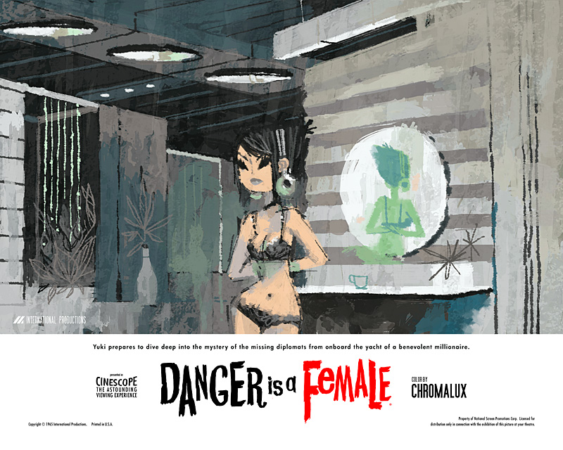
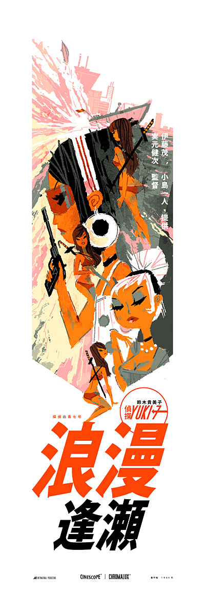
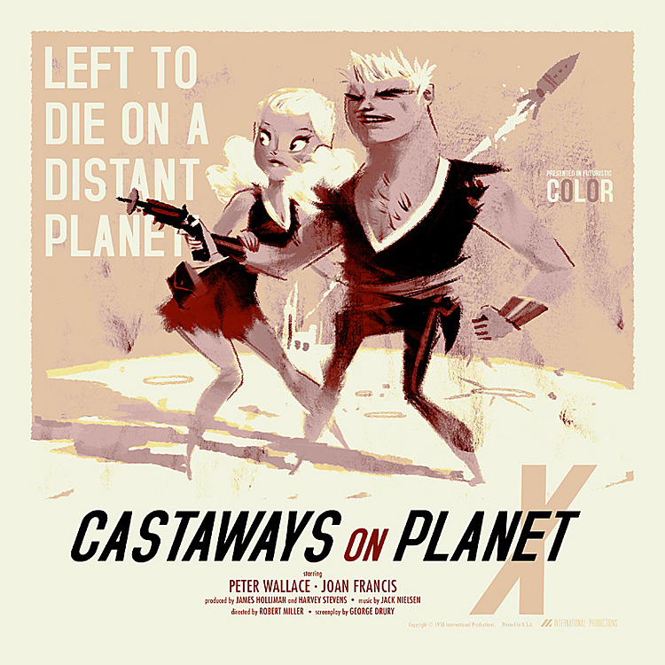
Hello my fellow appropiation fans. I'm sorry I haven't updated this blog for a while but i've distracted by very un-FO genres lately like sci-fi art, lowbrow, gothic, anime, etc. It didn't seem right that I fill this blog with lovely artwork when you've come to expect (if not crave) sculptures made of expanding foam with taxidermied dugongs sticking out of the top. Things will be returning to normal in due course. In that time I have been reading some very good books.


A HUGE book filled with aesthetically pleasing artists that I tend to overlook. In here you'll the the freshest and most interesting painting, caricature, digital art, graffiti and graphic illustration of recent years from artists who have difficulty being exhibited in fine art establishments. If only there were more democratic and eclectic galleries in the world ran by people who were willing to show visual artists alongside multi-media or conceptual ones. Contains some of my favorites like Ray Caesar and Daniel Richter.

Art & Ideas series: Conceptual Art


Well written and digestible book on what can easily turn into a very dry subject in the wrong hands. Filled with quotes artists, critics and even contextualized lyrics the author feels relates to the feelings and philosophy during concept arts heyday in 1970's. Can you envision Phaidon ever getting it wrong?

I've also been reading Vitamin 3D also published by Phaidon a lot more thoroughly and its turning up some interesting and overlooked artists, expect some future articles here to be about them. I also returned the Victor Alimpiev exhibition in the IKON Gallery, Birmingham. This time I actually remembered to go into the tower room and watch his uncharacteristically short video piece Is It Yours?. In it a young lady appears to be manipulated puppet like via the camera operators hand from a height. Its one of his more disconcerting and disturbing works for the girl crashes to the floor whenever the hand slackens the invisible connection between them, and she rise limply like a marionette when the hand tenses. I did buy a book called Russian Art in Translation which has some interesting images and articles within, but seems a bit thrown together and half-arsed to be brutally honest.

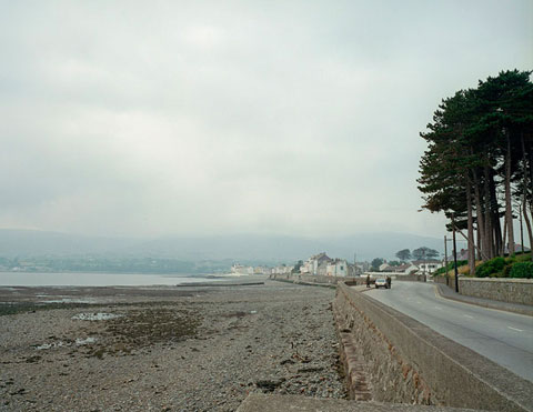
So never fear Fallen Over lurkers The blogs not dead, it just went on a small rambling trip retracing Robert Long's walking pieces. Thats bound to impress some of the more land art types that might visit the site. Cheers!


An Introduction to Fallen Over

Wednesday, 30 September 2009

Anonymous image from mini greenshines

This summary is not available. Please click here to view the post.

Kevin Dart

(click to expand and enlarge image)


I've got no good reason for posting this gentlemans work on an appropiation art blog, other than the fact I love it that is! His cutesy and shapely women look their best in his old school Bondesque posters for his fictional film series Yuki 7. I know the feminists and the body art fans out there won't like it but i'm afraid i'm going to have to put aside those critical protests and indulge myself. I did warn readers in my introduction post that I may contradict myself.

http://www.kevindart.com/

An Introduction to Fallen Over

Sunday, 27 September 2009

Fred Muram

(click to expand and enlarge)


Every project photographer Fred Muram presents us with the startling results of his mechanically simple projects is singular and surprising. Although all of his work operates on the principle of abstracting ordinary locations, people and objects or by conjuring surrealist scenarios without bending the rules of physics and biology - Fred has yet to become predictable and his various strategies for finding the extroadinary in the ordinary. My favorite works are to be found in his Rug series which all feature the human form obscured by rolled up rugs. I like how its unclear wether or not one individual played the role in all photographs or if many contributed their bodies for the project. Regardless of that it results in images that cleverly and gently veer between cosy humour and unfamiliar anxiety. They are by no means fearful looking creatures but there is also something almost inhuman/extrahuman about them.

An Introduction to Fallen Over

Wolven Angel


Impossibly underrated. Its easy to skim over names when browsing through the annals of IDM/Electronica territory but with (to date) only 2 listeners on last.fm this surely rates as one of my most overlooked flavor of the month. I like the contrast of dusty arcana imagery when you put it in context with his down-tempo sci-fi stylings. Like a more atmospheric Chevron sans the comedy or a heavily distorted and pained version of Rival Consoles. Go on his last.fm profile and listen to Ballerina Mists.

http://www.last.fm/music/Wolven+Angel/

An Introduction to Fallen Over

Saturday, 26 September 2009

Alex da Corte

(click to expand and enlarge image)


Isn't it nice how after so many decades Pop art and pop culture in general still holds true in the art world. Or to be more precise how tasteless materials and imagery are often considered at the same level as expensive or heirachially favored ones. Taste and refinement is boring. Alex da Corte seems to take particular pleasure in forming garish eye snogging miraculous hallucinations from multi-media works ranging from photography, sculpture, installation, text work and more besides. Its easy to see the initial glitzy splendour however there are less than subtle signs of discontent and angst once your sight has adjusted to the flood of celestial rainbowlight colored light. Dangerous serpentine animals (some realistically rendered, others scrappy like soft toys), young men trying to win back the hearts of their snubbed lady friends, good old fashioned trouble in paradise stuff. Rather than rampant nihilism da Corte seems to want to make us see the inherant beautyof our little fears and anxietes.

http://alexdacorte.com/

An Introduction to Fallen Over

Werewolf Jerusalem


I felt it was time to make a music related post as the visual/conceptual aren't my only interests. Whilst reading the Powerlines section of Zero Tolerance magazine I came across the work of a man eloquently named Richard Ramirez. His brand of noise is painfully minimal, dense, and always seemingly on the verge of falling apart. On his myspace he cites his influences include old exploitative horror films and the broken static between radio stations. If your a fan of Kylie Minoise at his most stark and unrelenting or would like to hear what a rawer and less melodius Nackt Insecten would sound like then I heartily recommend Werewolf Jerusalem. Go on his profile (link provided below) and listen to Knock On The Door.

http://www.ztmag.com/

An Introduction to Fallen Over

Friday, 25 September 2009

Unscheduled time off work

I've been suspended from work this week, surprisingly with full pay, which is nice of Asda to say the least. Considering the reason I was sacked was because I took offence at the new store manager labelling me an 'internal terrorist' for commiting the heinous crime of disagreeing with him. My afforementioned punishment means i've had plenty of spare time on my hands to go look at art, boredom being a major requisite in appreciating and writing about art. Rather than hide out at home in shame awaiting to be summoned so I can once again embrace the loving bosom of my employers I instead chose to visit both the Wolverhampton Art Gallery and the IKON Gallery in Birmingham.


I personally wouldn't recommend the Wolverhampton place to anyone. Eclectic multiple-show venues can be good if either given a clear distinction between exhibitions or tangiable and convincing links between them. The New Art Gallery in Walsall pleasantly hadoukens its way into my memory. However i've never been to a gallery more thrown together and half arsed than this. I had a bad feeling the very second I walked in and saw Steve McQueens new cabinet work featuring mock up postal stamp sheets printed with the faces of soldiers whom have died during service in Iraq. I was invited to sign a petition to have these things circulated into actual use. I politely declined. Lets just say i'm not on board when it comes to this idea that men and women are fighting in the middle east to ensure the freedom of gods own country. Besides, being an internal terrorist it wouldn't be the right thing to do.

To be fair to Wolverhampton things started to look up when I nervously backed away from McQueens piece (whilst dodging all the imaginary rolled up Sun newspapers eager to smack me over the head in heroic righteousness) when I entered into the somewhat more reasonable and open ended exhibition about conflict. The Northern Ireland Collection: Fresh Perspectives had some exceedingly good work on show. Much touted (and rightly so) were Paul Grahams large photographs of Irish locales bearing traces of the animosity between protestants and catholics such as graffiti, paint marks 'tagging' territory and military personal conducting a stop and search on a quiet country road. Rita Duffy's altered object sculpture Veil takes a cruelly small and cramped cell from a disused womens prison and through the spy holes you'll a vibrantly/violently red interior with glass tear drops hanging from its ceiling. A very potent message for how easily basic human rights can be suspended in face of political and social strife.

Sadly there wasn't much that inspired me after that. There was some cutting edge ceramics by someone called XUE Lu in a main exhibition space foyer, seemingly just there because they could be. They were rather good to be fair. If only the gallery could of been bothered to organize an ACTUAL collection as opposed to about 5 plates on a pedestal. There was a strangely funny animation hidden under some stairs by a man called Andrew McDonald which featuring a headless man pottering around on a rocky landscape shaking his fists and hiding just below the outcrops edge. It was much better that all the lovely chummy paintings of cats and soft porn nudes in the next room.

Needless to say at this point I gave up on the place. There was some victorian art upstairs and another exhibition about works on paper. Apart from fairly interesting additions by Toby Ziegler and Ruth Claxton it was equally dull. I won't mention the sense room, at least not without shuddering with cliched fear. Wolverhampton Art Gallery isn't doing itself any favors by trying to be every kind of art gallery and museum imaginable. The space could be used better in an IKON gallery esque manner. Hosting 2 or at most 3 solo exhibitions. Its a varied venue but its so badly curated that its events totally lack any sort of context and ultimately any point.


However - today I went to the IKON in Brum, and once again that wascally' gallery has given me nothing to complain about. The 1st floor exhibition of Victor Alimpiev's video art (including the very surreal To Trample An Arable Land, the name co-opted as the exhibitions title) was definately my highlight of the month. The first video you are confronted with shows the back of two girls heads. The one furthest from the viewer stands next to a long pinkish curtain or flag, the closest to us stands behind the other performing odd and seemingly senseless actions with her hand against the nape of more distant girls neck and back.
Though gentle and achingly uneventful her actions feel threatening and suggest infliction, but its that subtely I mentioned that undermines that fearful aspect with something more intimate and consensual. There could be elements of both in their relationship, or none at all. The facelessness and muteness of the actors makes this video his most abstract and thus could be read in very non figurative non emotive ways. Whilst chatting about it to one of the guides a mother and her young children sat down to watch the piece. One of her sons whispered "is this going scary mum?" with a noticeable tremble in his voice. He's got a point.

The exhibitions self-titled piece was esoteric... Oh all right it was difficult and bloody odd! But i'd say thats its strength and ultimately why I liked it so much. Unlike the afforementioned video we actually saw our protaganists faces. There was four girls stood on the lowest point of a ramp and behind them were an indeterminate amount of other people carrying flagpoles. My current estimate after watching the credits at the end and being surprised by how many people actually performed / how many I actually saw is about 500 billion individuals. Over the course of 15 minutes they inched up the ramp, stopping often to crouch or sit down, in one of the most brutally minimal and slow performances i've ever seen commited to film. Another piece that held my attention was Wie heisst dieser platz? which involved a young lady speaking to (eventually almost screaming) at a group of uncomfortably huddled in German. They slowly but surely turn their heads away from her, exiling her from the group. She stands right up to their faces but even this is enough in Alimpiev's closely shot world to suggest ostracization.
You really should go see this if you live in Birmingham and are even vaguely interested in video and/or performance art. Two other pieces called My Breath and Whose is this exhalation? are featured are they throw in some theatre/opera elements for good measure. Apparently theres another video showing in the tower room but being the huge prat I am forgot to go see it for myself.

On the 2nd floor are some very good paintings by someone called Semyon Faibisovich. He takes pictures on his mobile phone of unpretentious and slightly eccentric individuals he comes across in his native Razgulyai district in Moscow. He then expands and enlarges this pixellated photorealist paintings. One piece entitled Builder is massive. It consists of gargantuan close up of a vaguely bemused builders face spread out over two canvasses. I could of swore it was bigger than my house. Whilst it didn't captivate me in the same way Alimpiev's complex non-narratives did it nethertheless fills me with joy when an artist paints the ordinary to reveal the extraordinary. Not a bad day by any means when you consider that I was supposed to be stacking shelves.

http://www.wolverhamptonart.org.uk/
http://www.ikon-gallery.co.uk/

An Introduction to Fallen Over

Wednesday, 23 September 2009

Armen Eloyan

(click to expand and enlarge image)


I discovered this fellow in the newest issue of Art Review in the exhibition review pages. I immediately liked his demented and hellish take on 'bad painting'. Like George Condo, Armen fills a void in my heart that spastically and unconsequently violent cartoons used to fulfil before they became undesirable. What makes paintings like this so vital however is that the zany characters and wacky scenarios take on an air of menance and horror when frozen into these cramped and lavish paintings. The safety of the cartoon worlds "bounce-back" physics has collapsed and now your forced to see how these individuals have mutilated themselves.


An Introduction to Fallen Over